Do WooCommerce add to cart buttons look smaller on your website? Do you want to make the size bigger or make it take the full width of the content area? In this article I will show how you can easily resize a WooCommerce add to cart button to full width.
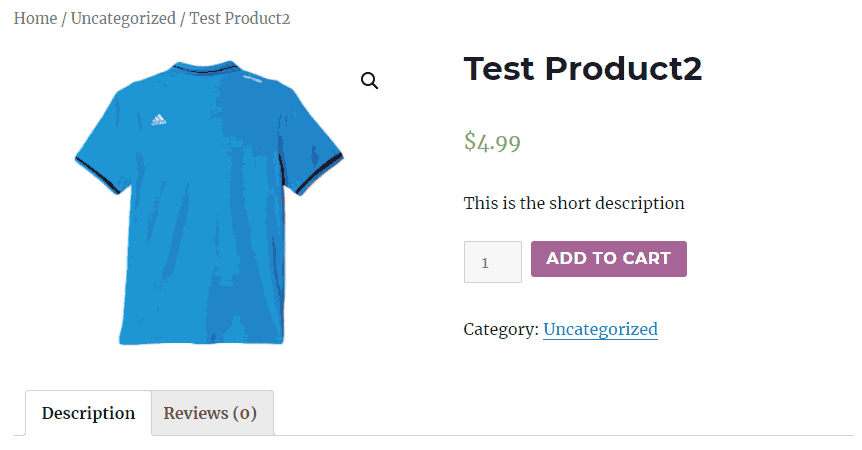
This is how a WooCommerce add to cart button looks by default on the product page.

In order to change the size of the button go to Appearance > Customize from your WordPress admin dashboard. Select Additional CSS and enter the following custom CSS code,
.single_add_to_cart_button.button.alt {
    display: block;
    width: 100%;
}
Click Publish and close the window.
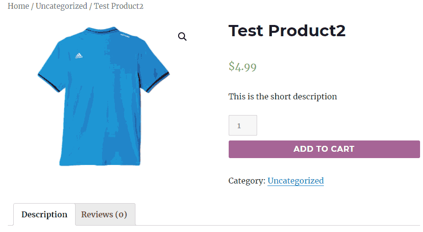
Your WooCommerce add to cart buttons will now look bigger and take the full width of the content area.

That’s all you need to do to make your WooCommerce add to cart buttons bigger. If you have any suggestions or the code doesn’t work on your site, let me know in the comments.
Fab! Have searched a few sites and the codes didn’t work, but this did 🙂 Thank you!
I’ve even changed the font size so it matches the Apple Pay button
.single_add_to_cart_button.button.alt {

    display: block;

    width: 100%;

    font-size: 15px;

}
Now I’m trying to do the same with the ‘Proceed to Checkout’ button which appears on the Basket page. I’ve tried various things, but none working (because I’m not a coder and I don’t know what I’m doing!) Any ideas?
.proceed_to_checkout_button.alt {

    display: block;

    width: 100%;

    font-size: 15px;

}
I fixed it, and made the check-out text on the button bolder and the button colour a bit highlighted, so sharing here 🙂
.wc-proceed-to-checkout .checkout-button.button.alt.wc-forward {

    font-size: 15px !important;

    font-weight: bolder !important;

    width: 100% !important;

    background-color: #37a6d6;

}
@Alice, Thank you for sharing the code 🙂
How to change my size of the “add to cart” on my site, I have done many ways but cannot make it, could you please let me know how to do?
@Cheryl, Are you using WooCommerce?